My learning curve on this project has been steep as I have been introduced to sophisticated tools such as market research and evaluation. I have been hands on in production techniques, photography and desktop publishing, as well as editorial, copywriting and art direction. This is all a long way from my preliminary task which was where I just had fun with letting my imagination dominate. I have moved on from instinctively judging what I think is right to a more scientific and considered approach which has given me a much better chance of success than just relying on a hunch.
Before embarking on this project I had never had to consider such things as the codes and conventions of magazines, textual analysis and deconstruction, mood boards, brain storming, market research and audience segmentation, compiling data and generating insight, technical, artistic and journalism skills. I have realised that success in a crowded market place such as that for magazines can never rely purely on luck or accident rather, it requires precision and evidence based approach, lots of hard work and maybe a bit of luck.
It’s been a long and hard journey and one which I have enjoyed, maybe now the time is right for Revolution!
Transformation of preliminary front page of my Esher College music magazine, to final design of my music magazine front page
You can see the difference in quality and care when seeing the prelim contents page compared with the music magazine contents page
Thursday 26 March 2009
Question F: What have you learnt about technologies from the process of constructing this product?
Throughout the production of my music magazine pages, I have learnt about the technological processes required to succeed. For example, I now have a broad understanding of the Adobe Photoshop which I used to manipulate images taken from my photo shoot into an appropriate format/ style for use on my front page, contents and double page spread (DPS). And InDesign which I used to help layout and position all the different sections created in Photoshop into a manageable, viewable arrangement.
I was also able to match conventional criteria specific to my chosen genre. With the aid of this software I was able to more accurately target my particular audience through setting appropriate colours, shapes and any additional images needed.
Another example where I used modern technologies in the production of my magazine pages was the photo shoot which I set up to get images for my front cover, contents and DPS pages. I was able to get such good quality photos due to the professional lighting equipment, SLR cameras and backdrop provided. Not only did this allow for such brilliant photos as an end result, but also reduced the amount of editing and manipulation needed by the above mentioned programmes to get the photographs in a usable form for my magazine.
Through constructing my magazine pages I learnt that due to the advances in modern technology, we have so many high production value products widely available to anyone, anywhere. And that a lot of effort and different teams working on one product make this possible.
Image A : In this image you can see the backdrop and profesional equipment used to ensure a good quality image as an end result.
Image B : This is a print screen of my preliminary front cover in Adobe InDesign. One of the many sophisticated programmes I was introduced to throughout this project.
Image C : This is a print screen of my final Front Cover in Photoshop, another technology I used to create my music magazine pages.
Question E: How did you attract/ address your target audience? To what extent do you think you were successful?
My market research was key in attracting and addressing my target audience. I used the findings from my research to construct a psychological profile of a typical reader. Once I knew who I was talking to, I knew what language to use. This translated into the iconography and visual style of Revolution magazine informing everything from photography, layout, colour scheme, text and content. For example, 80% of people preferred live photography over posed photo shoots, and this is reflected in my edition of Revolution (contents page – Kings of Leon live at the 02). Items such as reviews, interviews and competitions all scored highly in my research, and are therefore featured prominently in my music magazine. I made a conscious decision to use language in all its forms, both visual and verbal that would be familiar and reassuring to my target audience. Revolution is like a mate you want to spend time with rather than a lover you have to work hard at.
I am satisfied that I have been successful in creating a dialogue with my target audience. Revolution looks, feels and sounds like a real magazine. It would not be out of place on the shelves of WHSmiths, alongside Kerrang, Q and NME. My conclusions are further backed up by some audience feedback that I conducted. One quote ‘it fits in nicely with similar magazines’ is typical of the audience reaction.
Question D: Who would be the audience for your music magazine and why?
During the post production of my music magazine project, I carried out a series of research tasks in order to gain sufficient information which I could later use to aid my production to best suit my target audiences needs. One method of collecting research I used was getting 20 people to fill out a questionnaire, 12 of which responded that Alterative/ Indie rock was their favourite sub genre of rock music, because of this as well as my own personal preference of music, I decided to make this the genre of my magazine. I also believe that there is already an audience for such genre/ style of magazine and would therefore fit in nicely with what is available.
As stated in the above psychological profile which I created, my primary target audience would be male, late teens/ early 20’s, middle class, whose hobbies include playing video games, socialising with friends, music and creative art. I have chosen this audience not only because of my research, but because I feel that I am my own audience as I meet the criteria of the psychological profile, this will enable me to be creative and through my personal touch and interests, it will also appeal to my primary target market.
My secondary target audience is younger teenagers of around 14 years old, who would perhaps enjoy collecting magazines as a hobby. And who aspire to the music scene enjoyed by thier older brothers.
Question C: What kind of media institution might distribute your music magazine and why?
Bauer is a good example of the kind of media institution who might distribute Revolution - www.bauer.co.uk. Their main focus is in magazine publishing so they would have experience of success in this market place. An example would be Kerrang. Media groups like Bauer have other interests too, and a brand like Kerrang can be extended into television stations, radio stations and live events. These would all prove useful vehicles for introducing a new entrant to the market place. By promoting across these different media, Revolution magazine could quickly gain traction amongst the target audience. Media owners like Bauer, spend considerable resources in understanding their audience. Entering into conversations with them, for example online and other interactive media, to generate data and audience insight. These insights are used to inform marketing campaigns that are effective in reaching niche audiences.
Other examples of media institutions who work across different platforms would be the BBC, who is famous for being ‘on TV, on radio, online’. They also have considerable publishing credentials. It is also not uncommon in this day and age for companies like sports brands and car manufacturers to become media owners for example, Audi has its own broadcast television channel as does Arsenal, Manchester United and Chelsea. The power of trusted brands to take audiences with them is a common characteristic of the modern media landscape. Richard Branson’s Virgin would also be a very good example, because what started off as a music label now runs across radio, airlines, trains and banking.
Wednesday 25 March 2009
Question B: How does your music magazine represent particular social groups?
My initial research indicated a profile for the particular social group my music magazine is aimed at. It is typically male, late teens, middle class. They are into video games, live bands and socialising in pubs. It’s home-grown, a little bit grungy and intellectual as opposed to high street, ‘teeny bop’ and popular fashion. The image featured on the cover is representative of this demographic, the offers of exclusive content and the pioneering ethos represented in the ‘first ever’ feature will also appeal to the profile. The typical ideology of this group which is centred around being first, competitive and revolutionary is well represented by all of these elements featured on my cover page.
These themes are also found on my DPS. The band member is wearing odd socks but he is relaxed in his own idiosyncratic style slightly outside of the conventional norms. The accompanying monochrome images show him on stage, chilling out with other band members and back stage interviews. All blokey, relaxed, easy style.
The profile of this group will have an artistic flavour. The contents page echoes the more home made as opposed to ‘processed’ style. The retro typeface and rotoscoped frame typically represent this particular social group.
The above is an image of my contents page, which I feel accuratly reflects my target audience and therefore will attract them to buy my magazine. It is chaotic, busy and packed full of infomation relevent to the genre of Alternative Rock music.
Question A: In what ways does your magazine use, develop or challenge forms and conventions of real music magazines?
Rather than actively challenging the forms and conventions of music magazines, I have used the characteristics of a particular genre, in this case Alternative Rock.
For example my cover model partially obstructs the masthead. This is typical convention across all well established magazines. Whether it’s Vogue, Rolling Stone or the cover of Time, the consistent iconography and readily identifiable typeface are enough to signify recognition amongst the crowded news stand. My example shows that Revolution is a confident, well established publication and can allow the cover model full prominence as the major selling point for the edition. The multiple coloured clothes and strange awkward pose are other examples from the genre of alternative rock mags. The layout positions the model in such a way to allow space for appropriate hooks such as the first ever interview, the top 100 feature and the exclusive.
The promise of the first ever interview anchors to the central image of the band member and creates meaning of the cover model, this is another convention which I have used in the front cover of my music magazine, as is the positioning of the masthead itself. It is positioned at the top of the magazine above the cover model and below the banner giving some insight to the contents. Spread out across the width of the page makes it easy to read and instantly recognisable as the title of the magazine.
The colour scheme used is also essential in setting up the image in which is being portrayed. The deep red symbolises anger, aggression and passion which all connotate rock ‘n’ roll music. Gold symbolises wealth and success which represents the genres lifestyle.
The conventions of layout, design and typeface that I’ve mentioned regarding the front cover continue to the other sections such as my contents page and double page spread (DPS). Aggressive colours, anti-production value style and the combination of posed studio portraits and live concert footage are all classic conventions from my chosen genre.
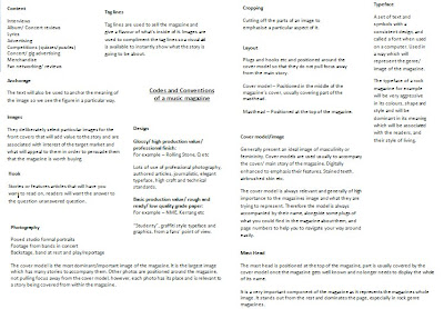
(Above is a screen print of my codes and conventions page in a word document, which is also in my scrap book)
Subscribe to:
Posts (Atom)