Rather than actively challenging the forms and conventions of music magazines, I have used the characteristics of a particular genre, in this case Alternative Rock.
For example my cover model partially obstructs the masthead. This is typical convention across all well established magazines. Whether it’s Vogue, Rolling Stone or the cover of Time, the consistent iconography and readily identifiable typeface are enough to signify recognition amongst the crowded news stand. My example shows that Revolution is a confident, well established publication and can allow the cover model full prominence as the major selling point for the edition. The multiple coloured clothes and strange awkward pose are other examples from the genre of alternative rock mags. The layout positions the model in such a way to allow space for appropriate hooks such as the first ever interview, the top 100 feature and the exclusive.
The promise of the first ever interview anchors to the central image of the band member and creates meaning of the cover model, this is another convention which I have used in the front cover of my music magazine, as is the positioning of the masthead itself. It is positioned at the top of the magazine above the cover model and below the banner giving some insight to the contents. Spread out across the width of the page makes it easy to read and instantly recognisable as the title of the magazine.
The colour scheme used is also essential in setting up the image in which is being portrayed. The deep red symbolises anger, aggression and passion which all connotate rock ‘n’ roll music. Gold symbolises wealth and success which represents the genres lifestyle.
The conventions of layout, design and typeface that I’ve mentioned regarding the front cover continue to the other sections such as my contents page and double page spread (DPS). Aggressive colours, anti-production value style and the combination of posed studio portraits and live concert footage are all classic conventions from my chosen genre.
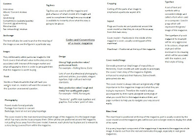
(Above is a screen print of my codes and conventions page in a word document, which is also in my scrap book)

No comments:
Post a Comment